How to Transform Inferior Decorating: Identifying and Correcting Decorating Mistakes
We've assembled a list of tips that tell you how to avoid (or correct) ten of the most common home decorating mistakes.
This article is not about creating the perfect magazine-worthy home décor or intimidating you with designer jargon and time (and/or money) consuming tasks.
Our aim is simply to present easy DIY decorating fixes with the basic information needed to implement them.
Whether you want to rearrange furniture in your living room, update your bedroom décor, create a guest room, shop for a dining room chandelier, or are downsizing or starting from scratch with your first studio apartment, these tips will help you make the choices that are right for you and your lifestyle.
Throughout this article, you will also find links to other pages that explore some of these topics in greater depth from coordinating fabrics to choosing colors, hanging pictures, and more.
We hope the tips included here will give you the confidence to decorate and accessorize your home to create a welcoming, comfortable place without worrying about making mistakes or wasting time or money -- and one that reflects your unique personality and style.
If you have heavy furniture or haven't purchased any yet, it helps to measure the room and its features first. Then draw the dimensions (graph paper makes it easier), translating the measurements into a scale.
For example, using a scale of 1 inch on paper = 1 foot of space, a room that is 8 feet by 10 feet will be drawn as 8 inches by 10 inches; if you use a scale of 1/2 inch = 1 foot, an 8 foot by 12 foot room would be 4 inches by 6 inches on the paper. In the first case, feet simply are translated into inches on a 1:1 basis. In the second case, you divide each dimension by two. Thus, a 13 foot x 14 foot room, on a scale of 1 foot = 1/2 inch, would measure 6.5 inches x 7 inches in your drawing, and so on.
It is also important to make sure that you note the location and size of doors, windows, hearths, or other features you will need to consider in deciding on furniture placement.
Make a few photo copies once you've done that. Then measure the "footprint" of each piece of furniture (the length and width or amount of space it takes up on the floor).
If you haven't purchased the furniture yet, use standard measurements or find pieces you like and use those dimensions to see if it will work in your home before you buy it. Cut pieces of paper to the same scale as the room dimensions and label each piece of paper.
You can then move the cut-outs around on paper until you find an arrangement that works with the space, purpose, traffic, and size. Tape them in place or use a dab from a glue stick to secure them to the paper.
By using the photocopies, you can easily create multiple arrangements on different pages and compare them to get an idea of how each works before you move the furniture. If you can't visualize it accurately from the drawings, you can use software that will create a three dimensional model for you to see or you can use the cardboard box method outlined in the next section.
1. Up Against the Wall. . . Not!
Many people think a room looks bigger when all of the furniture lines the walls around the room. And if you want a dance floor, that may work, but for most purposes, furniture looks better and a room looks more inviting when the pieces are at an angle or surrounded by space.
 Try angling your bed or sofa. Or float that large sofa facing a fireplace, two smaller conversational seating groups, or a pair of chairs arranged at an angle. Depending on the shape, size, and scale of your room, consider using two loveseats or settees instead of a large sofa.
Walk through the room and note the traffic patterns. Move the pieces around you find an arrangement that works with the space and with the traffic flow. That is, do not block access to other rooms or doors with furniture arrangements or individual pieces.
You will want to direct traffic while allowing easy access to pathways in, out of, and around the room.
Home Quick Planner: Reusable, Peel & Stick Furniture & Architectural Symbols
The Home Quick Planner includes 700 precut, reusable peel-and-stick, scaled furniture and architectural symbols, plus a floor plan grid to help you design your own projects. Simply lift the symbols and arrange them on the floor plan grid to design floor plans, move furniture and make changes. Step-by-step instructions and "Design Details: Critical Dimensions & Clearances" are provided to help you improve your design and save money.
Other Considerations
Consider the purpose of the space as well. Are closets or bookshelves accessible? Do you have a great view you want to feature? (See focal points, below.)
Never automatically push all furniture against the walls. Living room furniture placed around the perimeter of a room does not encourage conversation and can create a cold feeling or ambience.
A chair without a nearby light source will not become a place to read the latest book by your favorite author or complete your latest craft project.
A long and wide island in the center of your kitchen between your sink and refrigerator means you have to walk around it every time you go from one to the other.
Virtual Furniture Arranging
If you are tech-savvy, you might want to invest in floor plan software that will make it even easier to plan a single room or an entire house. Some of these apps have free trials you can download from their websites or your app store which may provide enough features for you to do this at no cost.
You will want to direct traffic while allowing easy access to pathways in, out of, and around the room.
Low-Tech Quick Floor Plan Kit
Home Quick Planner: Reusable, Peel & Stick Furniture & Architectural Symbols
The Home Quick Planner includes 700 precut, reusable peel-and-stick, scaled furniture and architectural symbols, plus a floor plan grid to help you design your own projects. Simply lift the symbols and arrange them on the floor plan grid to design floor plans, move furniture and make changes. Step-by-step instructions and "Design Details: Critical Dimensions & Clearances" are provided to help you improve your design and save money.
Other Considerations
Consider the purpose of the space as well. Are closets or bookshelves accessible? Do you have a great view you want to feature? (See focal points, below.)
Never automatically push all furniture against the walls. Living room furniture placed around the perimeter of a room does not encourage conversation and can create a cold feeling or ambience.
A chair without a nearby light source will not become a place to read the latest book by your favorite author or complete your latest craft project.
A long and wide island in the center of your kitchen between your sink and refrigerator means you have to walk around it every time you go from one to the other.
Virtual Furniture Arranging
If you are tech-savvy, you might want to invest in floor plan software that will make it even easier to plan a single room or an entire house. Some of these apps have free trials you can download from their websites or your app store which may provide enough features for you to do this at no cost.
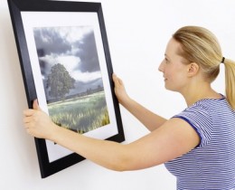
2. Picture this: Getting the Hang of It
Hanging pictures or other types of wall décor too high or using pictures that are too small for a particular spot are perhaps the most common home decorating mistakes.
Unless you are creating a period wall full of dado-to-frieze pictures, wall décor should generally be hung so that the middle of the picture (or grouping) is at eye level (from either a standing or sitting position, depending on where it will be viewed from) or a little (2 to 3 inches) lower than eye level, with spacing between pictures fairly equal or visually balanced.
Pictures should also be hung in a way that is proportional to their location. A single small picture hung over a sofa will not look right. Neither will two small ones spread too far about. They will be out of balance.
Always experiment with different arrangements and combinations of pictures before starting to hang any of them.
It is easier to create balance with a symmetrical grouping, but it is not difficult to balance an asymmetrical grouping either, although you'll have to rely on a bit of trial and error to create visual balance instead of a level and ruler or tape measure.
A grouping of pieces different in size, shape, color or other attributes will work better in an asymmetrical arrangement. Such a grouping should be hung so that the visual weight of the objects appears balanced. One way to do this without making a lot of unnecessary holes in your wall is to lay out the arrangement on the floor first, adjusting the grouping until you have arranged the items in the most pleasing (least lop-sided) way.
You could also trace the outlines of the items onto a roll of newsprint or inexpensive paper (that will contrast with your wallcolor) and arrange those on the wall with a hinge made of blue painter's tape on the back. (Other types of tape may remove paint from your wall.)
Decorator's Tip
Reposition the shapes until you are pleased with the arrangement and then use that as a guide for hanging the actual items.
A vertical arrangement will make a room appear taller and a horizontal arrangement will make it appear wider.
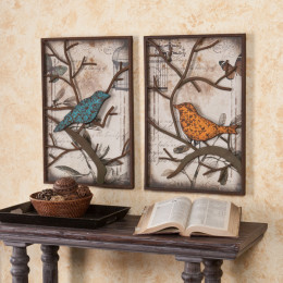
You might also want to consider hanging one larger item surrounded by a circle or rectanglular arrangement of smaller pictures. This type of arrangement is particularly effective for displaying a group of photos in a hallway.
Whatever arrangement you choose, frames and mats should complement both the artwork and your decorating style or theme.
A framed mirror can add dimension and light, and is especially effective when it reflects something beautiful, such as a window overlooking a garden or an indoor flower arrangement, for example.
Do not be afraid to hang artwork with a mirror as part of the group. Unless a mirror is large enough to look balanced on a wall by itself, you can keep the proportion pleasing by adding pictures next to or around the mirror.
Once you decide on an arrangement, start hanging from the center or largest item and then, if there is more than one item in the center of your arrangement, hang any that go above and/or below the central piece. Continue out, hanging items from top to bottom, until all of your pictures have been hung.
Whether you use picture hooks, molly bolts, toggle boths, picture nails, or some other method will depend on the type of wall construction and surface, so be sure you have the right type of fasteners available.
If your home is a rental, you may be restricted to non-invasive methods such as suspending frames from a railing or keeping your artwork lightweight enough to use magnetic or peel-and-stick types of picture hangers
Pictures Perfect
Can't find the right artwork or other wall décor to hang?
See if one of these will work for you.
Selections will change frequently, so check back to see what's new.
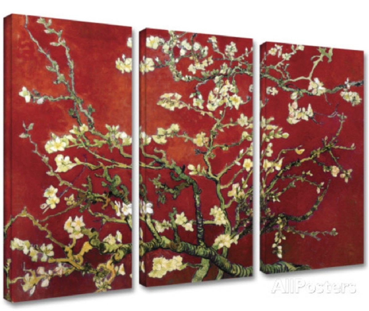
Artwork shown here is Interpretation in Red Almond Blossom" by Vincent Van Gogh in a 3-piece canvas set. Below is Sunset in Venice by Claude Monet. Both are available atAllPosters in a variety of sizes and formats.
See if one of these will work for you.
Selections will change frequently, so check back to see what's new.
Artwork shown here is Interpretation in Red Almond Blossom" by Vincent Van Gogh in a 3-piece canvas set. Below is Sunset in Venice by Claude Monet. Both are available atAllPosters in a variety of sizes and formats.
3. Become a Groupie

(No, not that kind)
Accessoriesare an important part of home decorating. They can make or break a room and are a great way to show off your collections and personalize your home décor.However, don't over-do it. If you have a large collection, put some of it away and rotate the items. Group the items together in one place rather than spreading around throughout the house.

4. That's Odd! Off-center is On-target
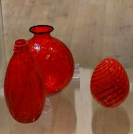
Unless your display is of Noah's Ark, avoid putting things in pairs. Odd numbers are far more interesting. A group of three or five items is usually better than two, four, or six.
Items that are different in shape, height, color, texture or some other dimension should be balanced, but that almost always means they should not be centered and spread out or lined up evenly in a straight line.
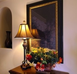
The third picture in the Picture This section, above, would not be as interesting if the lamp was removed and the flowers were centered in front of the mirror. By adding the taller lamp, and moving the flower arrangement to one side, the arrangement has balance and more interest. The lamp ties the grouping together and anchors it. Display your collections or objects grouped by color, material, or theme. Vary the heights, shapes, and textures for more interest.
Items that are different in shape, height, color, texture or some other dimension should be balanced, but that almost always means they should not be centered and spread out or lined up evenly in a straight line.
The third picture in the Picture This section, above, would not be as interesting if the lamp was removed and the flowers were centered in front of the mirror. By adding the taller lamp, and moving the flower arrangement to one side, the arrangement has balance and more interest. The lamp ties the grouping together and anchors it. Display your collections or objects grouped by color, material, or theme. Vary the heights, shapes, and textures for more interest.
5. Think Big -- Bigger IS Better!
Contrary to what many think, a small room decorated with small furniture is usually not the best way to go.
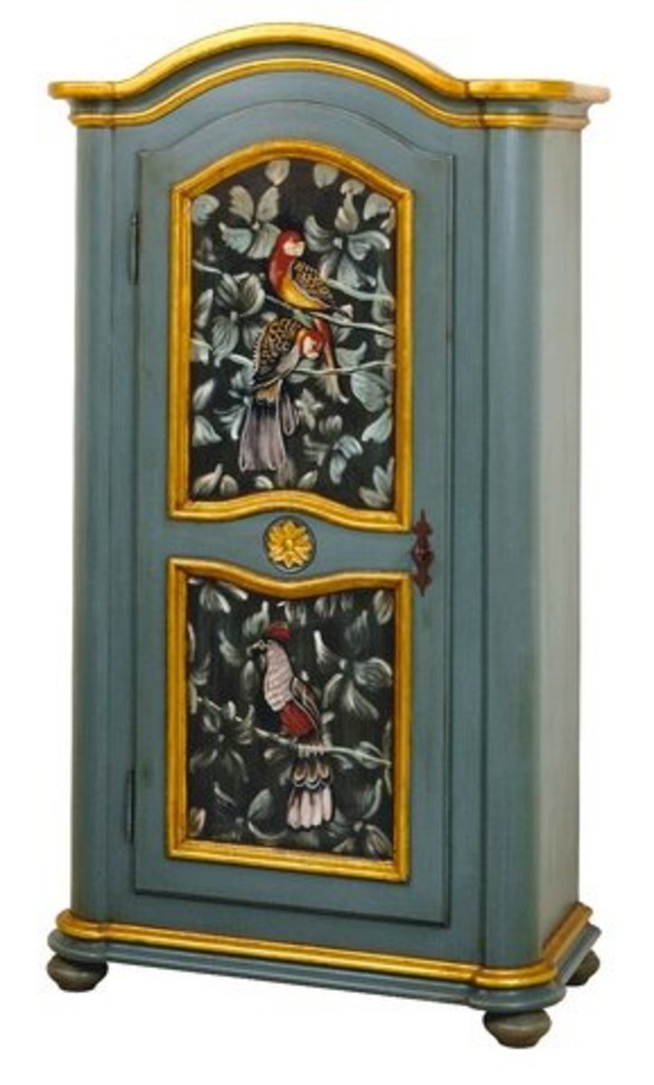
One larger (but not huge) "statement" piece -- such as an antique armoire, bookcase topped desk, or an overstuffed armchair with a carved wood frame -- will draw the eye and create an airier atmosphere than a lot of smaller scale furniture.
Start with your statement piece and arrange the other items in the room around it. For example, many smaller rooms often have a shelving unit against one wall, either freestanding or in the form of shelves attached to shelving strips affixed to the wall. Whether you use it for media and/or books, display, or other storage, replace the open shelves with an armoire to hold all of that "stuff" instead.
Perhaps angle the armoire in a corner of the room and arrange your seating and occasional tables to complement that. You'll be surprised how much better the space will look and feel.
6. Of(f) Color: Avoid White Blight
Although white walls are very appealing to some of you, having no color on the walls often makes a room seem cold and uninviting. It also makes it very hard to decorate. If you must use pure white, use it for trim, fabric, or accessories with a color or even a light neutral shade on the walls.

Purchase a small amount of paint and try it first. Live with it a couple of days. View it at various times of the day and night since the color you choose may look different with different lighting conditions and with different colors adjacent to it .It is worth the slight extra investment to avoid spending many times more only to have it turn out darker or lighter than you expected
Decorator's Tip
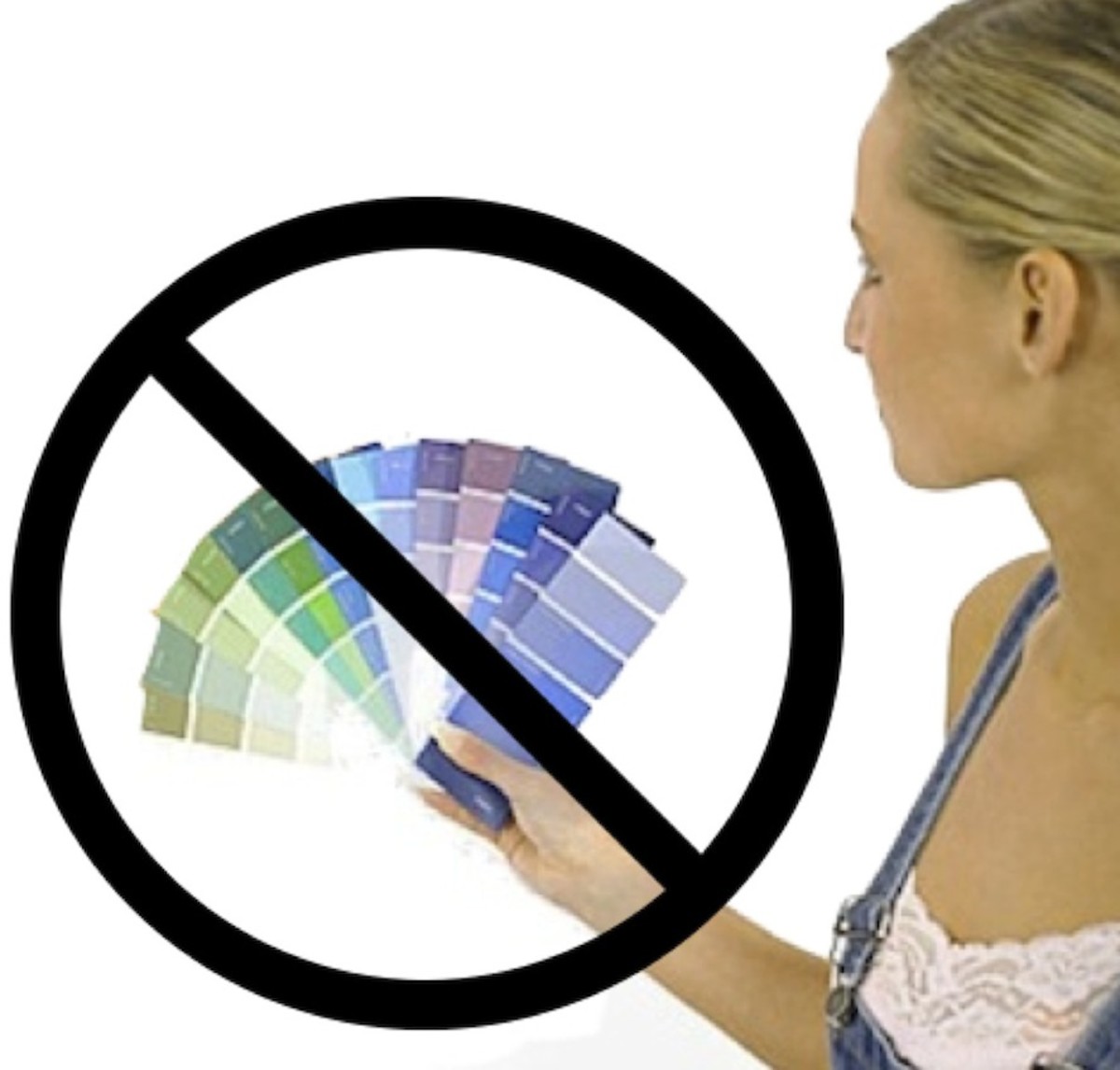
Do NOT hold your color swatches against a white wall.
The appearance of a color will look different depending on what other colors are adjacent to it. You'll get a much better idea of how the color will look if you look at it next to your furniture, window treatments, or cabinets. It also helps to see a larger area of color and even the larger swatches sometimes available today may not be big enough.
The appearance of a color will look different depending on what other colors are adjacent to it. You'll get a much better idea of how the color will look if you look at it next to your furniture, window treatments, or cabinets. It also helps to see a larger area of color and even the larger swatches sometimes available today may not be big enough.
Instead of putting the sample color on a wall, we suggest you completely cover a large piece of white foamcore board or posterboard with paint and look at it in different places in your room. If you are painting several rooms or want to make an accent wall a different color or hue, you can also paint another board with the different color and move them from wall to wall or even room to room and see which placement looks best.
With today's computer technology, paint stores can match almost any color you can find. You are not restricted to choosing colors available on paint chips. Expert paint stores can also make a color slightly darker or lighter - just be sure to check some dried paint to be sure it is what you want before you leave the store with your purchase.
With today's computer technology, paint stores can match almost any color you can find. You are not restricted to choosing colors available on paint chips. Expert paint stores can also make a color slightly darker or lighter - just be sure to check some dried paint to be sure it is what you want before you leave the store with your purchase.
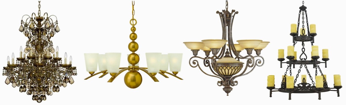
Chandeliers With Decorative Impact
7. Lighten Up in 3 Easy Steps
1. Lighting may be the most frequently overlooked element of home decorating. Besides the fixtures being design elements themselves, good lighting is related to function (as in task lighting, reading lights, etc.) and mood. Lighting should be chosen not only for the style and scale of the light fixtures but according to what the purpose of the room is and what type of ambience you wish to create. Dark rooms can be depressing and overly bright rooms can be harsh on the eyes and the nerves. Each room should have multiple lighting options, from a dimmer switch for the dining room chandelier to table and floor lamps near work and reading areas. Accent lighting can enhance your collections, artwork, or even your prize schefflera.
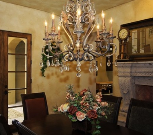
2. Long with the above, the most frequent lighting mistake in home décor is a dining room chandelier that is either too small (almost always) and/or hung too high. A dining room light fixture should be centered over the table and should not be flush or even semi-flush to the ceiling. It should hang above the table, with the bottom of the fixture no higher than 3 feet above the table. It should also be no smaller than about 9 to 12 inches less than the width or diameter of the table.
A table that is 4 feet wide and 6 feet long should have a chandelier that is 36 to 39 or 40 inches in diameter. A round table that is 5 feet in diameter (width across the middle) should have a chandelier that is no smaller than 48 inches in diameter. (For larger tables, my personal preference is to hang the chandelier even a little lower than 36" above the table as it makes it a more dramatic focal point). The chandelier should be on a dimmer (soft light is more flattering and conducive to dining) and don't forget the candles.
A table that is 4 feet wide and 6 feet long should have a chandelier that is 36 to 39 or 40 inches in diameter. A round table that is 5 feet in diameter (width across the middle) should have a chandelier that is no smaller than 48 inches in diameter. (For larger tables, my personal preference is to hang the chandelier even a little lower than 36" above the table as it makes it a more dramatic focal point). The chandelier should be on a dimmer (soft light is more flattering and conducive to dining) and don't forget the candles.
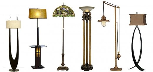
Bright Ideas For Table and Floor Lamps
From an accent to general and task lighting, there are a wide variety of fixtures and styles to complement your home décor. We have selected some of our favorite table and floor lamps below. Many of these styles come in both table and floor models, so if you like a style but the type you need isn't pictured, click on the info icon link to see the complete line.
3. Last but far from least -- Do not neglect the importance of sunlight (or the ability of ultra violet rays to fade furnishings and artwork). When thinking about room lighting you should also pay attention to the direction the windows of the room face, when it is likely to have the most sun, if you want the maximum exposure to that sun or it will be too glaring, if you want the light but not the UV exposure, or if you want to block the sun (in a media room or perhaps the bedroom of someone who works the night shift and sleeps during the day).
3. Last but far from least -- Do not neglect the importance of sunlight (or the ability of ultra violet rays to fade furnishings and artwork). When thinking about room lighting you should also pay attention to the direction the windows of the room face, when it is likely to have the most sun, if you want the maximum exposure to that sun or it will be too glaring, if you want the light but not the UV exposure, or if you want to block the sun (in a media room or perhaps the bedroom of someone who works the night shift and sleeps during the day).
These things should all be considered when selecting the appropriate type of window treatments.
Do you need to filter light? (semi-sheers and similar types of curtains, uv blocking window films)
Block light? (light-blocking shades, blinds, and/or heavier draperies)
Create privacy? (opaque treatments, including shutters)
Not block a great view? (consider no window treatment or just a valance and/or easy-to-open styles)
Improve energy efficiency? (think thermal, shutters, energy saving window films)
All of these lighting-related factors should be considered in deciding on window treatments in addition to budget, lifestyle (Do you really want puddling drapes if you have pets), and taste preferences.
Lighting Essentials
Whether a reproduction of a historic period oil lamp, a halogen "high hat" hidden in the ceiling, or the
latest in pendant track lighting, you also need to consider the type and size of lightbulb (flourescents are energy efficient but can provide harsh light), installing a dimmer switch for the main light source, the proportions of the lamp or fixture in relation to your furnishings, and especially the job you want the light to do.
Look for warm lighting and, for work areas, we find that full spectrum lighting is best, especially if you work with color like we do.
Look for warm lighting and, for work areas, we find that full spectrum lighting is best, especially if you work with color like we do.
8. What's the (focal) Point? Every Room Needs One
A focal point serves as the focus or anchor for the design of a room. In other words, it is the glue that brings a room together and creates interest. Some may not be aware of what a focal point is and what it does for a room so their rooms either tend to have no focal point or to have too many. The result of either is the same - confusion.
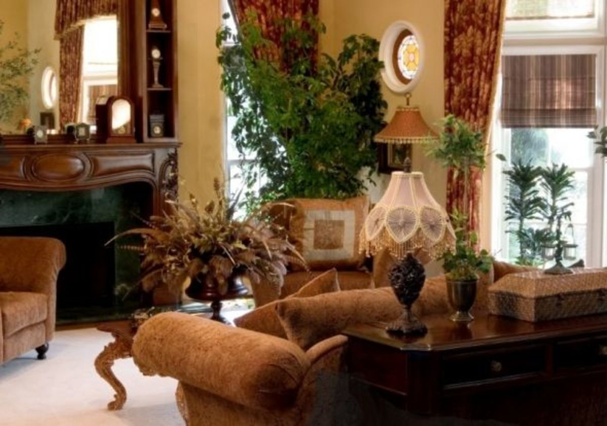
So, what is a focal point? In general, it is the most dramatic element in a room. It is what your eye is drawn to when you first enter a room. It is attention getting and should be the center of attention of your décor.
The focal point can be a fireplace, a large picture window with a great view, or a headboard, entertainment unit or armoire. Furnishings should be arranged in relation to the focal point -- such as a conversational group around a fireplace. Other main elements in a room are arranged to face, frame, or be part of the focal point.
If your space does not have an architectural feature to serve as a focal point, you can create one by using, for example, a dramatic (in scale, style, color, design) piece of furniture, a sculpture, a striking painting on an easel or a picture hung on a wall.
Great Focal Points Anchor a Room
If your room doesn't have a focal point, you can create one as described above or you might want to consider arranging your room with one of the following as your focal point. We've personally selected each one for it's great look and special features.
9. Stifle Those Yawns - Monotony is Boring and Tiresome
Matching furniture, everything the same color, an over-done "theme" room, the same fabric used everywhere (on furniture, windows, accessories, you-name-it). If your room looks like it came out of a store catalog and everything matches -- be it a "suite" of furniture, a color, or ruffles or a themed motif on everything, looking at the same thing all of the time is boring because it lacks interest and personality.
Sure that set of furniture or bedroom linens/curtains/lampshade ensemble looked great in the catalog or showroom. It is supposed to. They are trying to sell as much merchandise as possible and it worked as a sales tool because you bought it. But once you get it home, matchy-matchy becomes worse than wishy-washy. An overly matched room can also give the impression of being cluttered.
What to do? Break up the set. Swap pieces with items from other rooms -- maybe the bedroom nightstand would work as an endtable in the living room or the dresser (sans mirrors) could be used as a server or buffet in the dining room or against a foyer wall. List them on eBay or Craig's list and use the proceeds to find a more interesting replacement. Donate part of the set to charity and enjoy helping others (and the tax benefit).
You might also try painting one piece, changing the hardware, and maybe even add a marble, granite, tile, or Mosaic top to transform a standard piece of furniture into a fun, artsy, unique item. Decoupage and other techniques can also be used. Items in a room should coordinate and create a balanced, complementary look while serving as functional parts of your home but items that look like they came out of the box will make you feel like you are living in one. Think outside the box.
10. Flying Carpets Belong in Fairy Tales
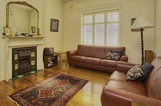
Rugs are not supposed to float or fly except in fairy tale air space. Rugs that are too small are not only hazardously easy to trip on, they float in the middle of a floor, break up a room and are distracting. Before you decide on a size for a rug, use blue painters tape to outline where you want the rug to go.
A rug should anchor the furniture. If a seating arrangement, at least the front feet of the furniture should rest on the rug. You do not want a "floating" coffee table.
Similarly, do not put a too-small rug under the dining room table and have the chairs float around it. It should be large enough for the chairs to fit on as well so that the furniture is both physically and visibly connected.
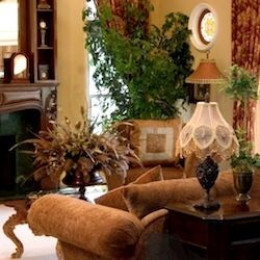
BTW, that's not the only problem with the room in the large photo above. Can you identify the others?
A room-size area rug should have a 9 to 12 inch border of floor showing between the rug and the wall.
If you want to cover the entire floor, you probably should consider wall-to-wall carpeting instead.
If you are using a room-sized area rug, it should be large enough to tuck under the edges of any furniture around the room, such as servers, or china cabinets.
If you already have one that it is too small, use it somewhere else.
Similarly, do not put a too-small rug under the dining room table and have the chairs float around it. It should be large enough for the chairs to fit on as well so that the furniture is both physically and visibly connected.
BTW, that's not the only problem with the room in the large photo above. Can you identify the others?
A room-size area rug should have a 9 to 12 inch border of floor showing between the rug and the wall.
If you want to cover the entire floor, you probably should consider wall-to-wall carpeting instead.
If you are using a room-sized area rug, it should be large enough to tuck under the edges of any furniture around the room, such as servers, or china cabinets.
If you already have one that it is too small, use it somewhere else.
No comments:
Post a Comment